
THE
11TH FFVII Cover art gallery |
|
 NTSC-J 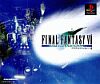 J - International 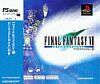 J - Intr'ntl. - PS one Books 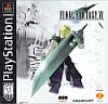 NTSC-U/C 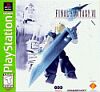 U/C - Greatest Hits 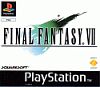 PAL 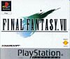 PAL - Platinum |
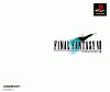
To your left you will see every known variation of FFVII cover art across Japan, North America and Europe. Why? Because how is any hopeless geek going to learn how to criticize boxart well without seeing it in person first?!? The Japanese art is ... well, there's not much art at all. But therein lies the brilliance, because everybody in Japan knew what it was, and they didn't need it spelled out for them on the front (well it was, but we mean figuratively). The whole thing could have been white and it still could have screamed "I'm Final Fantasy VII. Hurry up and buy me." FFVII International's cover has a little more substance to it, if that's what you're looking for. And the game has more substance as well! FUN FACT: International and FF Tactics are the only PSX FF games to be rereleased in Japan! WILD AS HELL, I KNOW Why Sony decided against using the Japanese cover for the American release of the game is beyond us. After all, it worked out fine for Metal Gear Solid! As it stands, though, the result wasn't so bad. It successfully conveys the message that the game is about a guy with a big sword that has two holes in it. The new player asks themselves "what's with the holes?" and then they're forced to buy the game and then they find out. Unequivocal genius. While people like to rag on the lime green Greatest Hits stripe, in our opinion it's a far better deal than having to look at a hideous PAL cover with the awkward stripe on the bottom and the oversized FFVII logo. Seriously, what is with those people? Have you seen a European Dreamcast cover? It's like an EB mockup accidentally slipped into manufacturing. It's craziness! Every console in Europe has had horrible box art templates. GAWD! No wonder it's so bad off there. Not that I take it personally or anything. |